War Without End: Part 3: The Cost
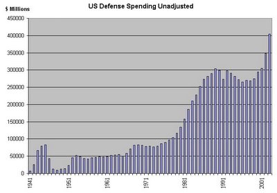
These two graphs represent how much we spend on the military each year. This first graph represents how much is spent using dollars that are not equal, for example, the buying power of one dollar in 1960 is not equal to the buying power of one dollar in 1990: you could buy a lot more with one dollar in 1960 than you could in 1990.
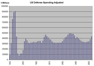
The graph below presents the same information but uses dollars that are equal, that is, amounts for each year have been adjusted to reflect the greater buying power of dollars from the past. This adjustment was made using the Consumer Price Index (http://data.bls.gov/cgi-bin/cpicalc.pl). It is important to note that the graphs have the same year scale on the x-axis but that the dollar scale on the y-axis is different for each graph, that is, even though the graphs are the same physical size, the second graph represents about twice as much money.
Military spending across time has been pretty constant, even though this period includes the Korean War, the Vietnam War, the Cold War, the dissolution of the USSR, and our current war on terror.


0 Comments:
Post a Comment
<< Home